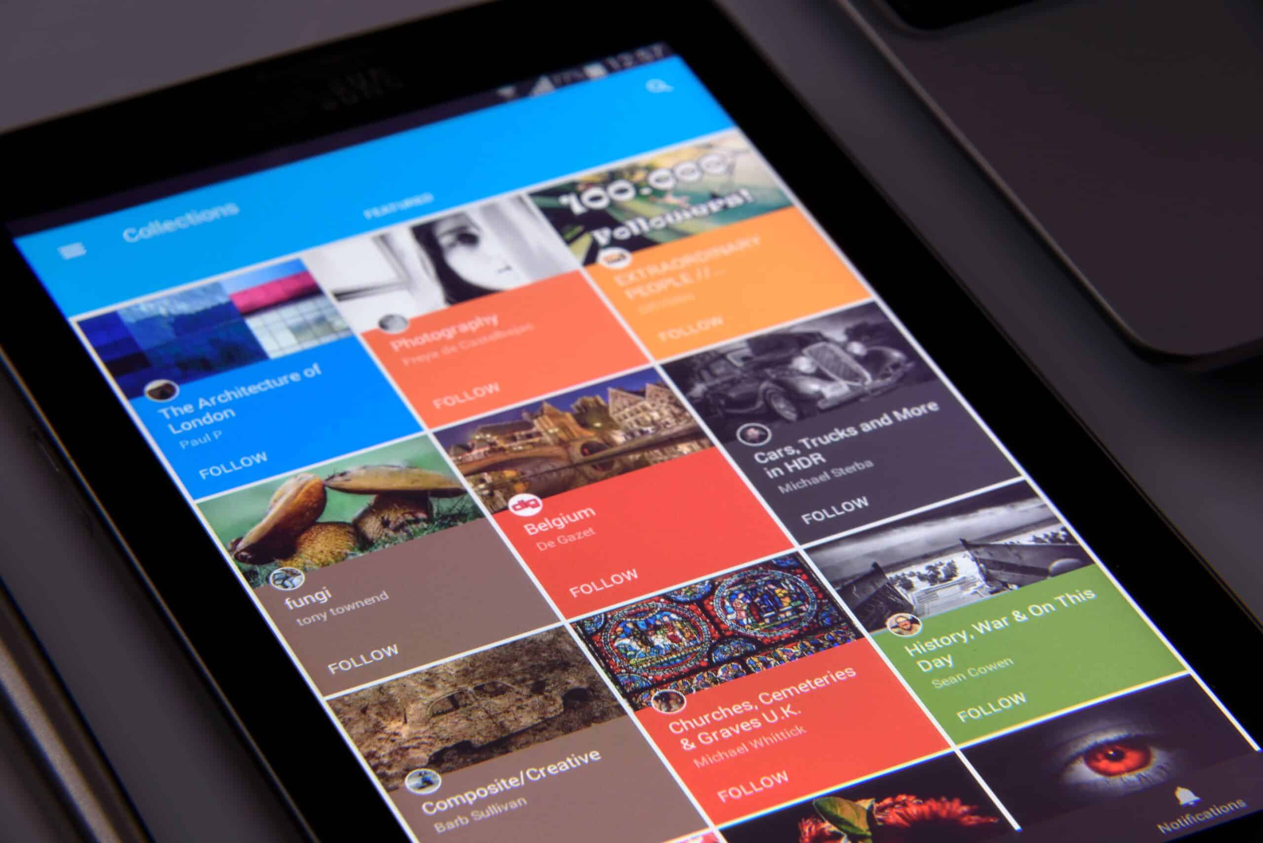
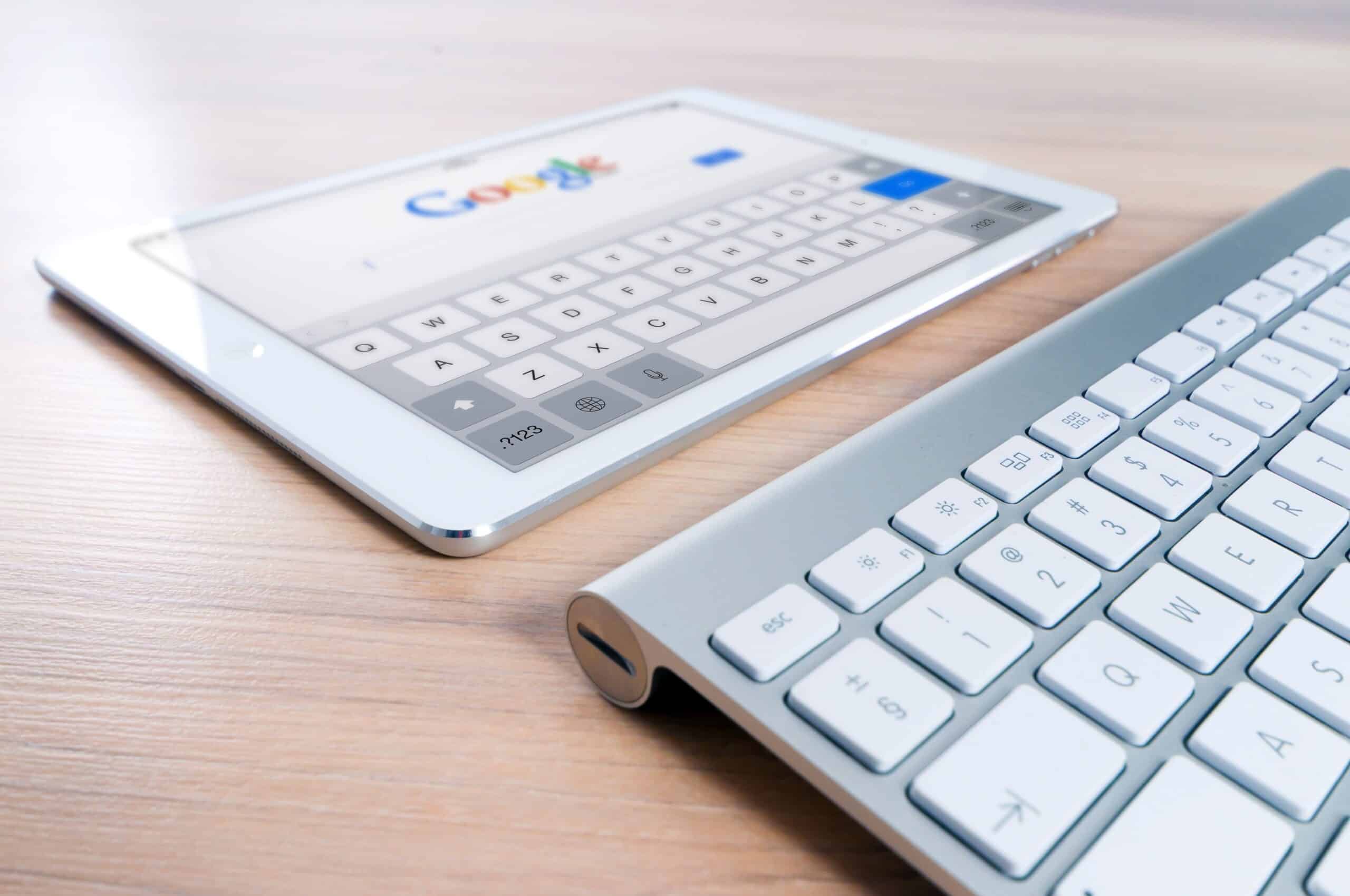
In an increasingly digital world, your website is very probably the first interaction potential customers will have with your business which is why responsive design is no longer optional.
Whether they’re browsing on a desktop computer during work, checking your services on a tablet at home, or searching on their smartphone while on the move, they expect a fast, seamless experience. If your website doesn’t adapt to different screen sizes, you risk losing visitors before they’ve even had a chance to explore what you offer.
Again this just underlines why responsive design is no longer optional; it’s a fundamental requirement for any business that wants to succeed online. A responsive website doesn’t just improve the user experience; it also supports search engine rankings, boosts conversions, and helps future-proof your online presence.
What is responsive design?
Responsive web design is an approach that allows a website to automatically adjust its layout, images, and functionality to suit the specific device being used. Instead of creating separate desktop and mobile versions of a website, responsive design uses flexible layouts and media queries to ensure content looks and functions well on screens of all sizes.
Whether someone is viewing your website on a 27-inch monitor or a 6-inch smartphone, they should be able to navigate easily, read content comfortably, and complete actions without frustration.
As mobile usage continues to grow, it’s clear that responsive design is no longer optional for businesses that want to meet modern customer expectations.
Mobile traffic continues to grow which means responsive design is no longer optional!
More people now access the internet via mobile devices than desktop computers. Consumers use smartphones to search for products, compare services, read reviews, and make purchases at any time of day.
If your website isn’t optimised for mobile users, visitors may encounter multiple problems:
- Tiny text that’s difficult to read
- Buttons that are too small to tap
- Images that don’t scale correctly
- Horizontal scrolling
- Slow loading pages
- Broken layouts
These issues create a poor user experience and often result in visitors leaving your website and straight into the digital arms of a competitor.
Responsive design improves user experience
A positive user experience is one of the most important factors in keeping visitors engaged by providing:
- Easy navigation
- Readable content
- Fast loading pages
- Mobile-friendly forms
- Consistent layouts
- Touch-friendly buttons
When visitors can quickly find the information they’re looking for, they’re more likely to stay on your website, explore additional pages, and ultimately become customers.
This is one of the biggest reasons why responsive design is no longer optional in today’s competitive online marketplace.
Better responsive design means better search engine rankings
Google has long prioritised mobile-friendly websites when determining search rankings. Its mobile-first indexing means that Google primarily uses the mobile version of your website when evaluating content for search results, responding positively to:
- One consistent URL structure
- Improved page speed
- Better user engagement
- Lower bounce rates
- Easier crawling and indexing
Businesses with outdated, non-responsive websites may find it increasingly difficult to compete in search engine results.
Get higher conversion rates
Every visitor to your website is a potential customer. If they struggle to navigate your website or complete a purchase on their mobile device, they’ll leave before converting so you need to make it as easy as possible to:
- Contact your business
- Submit enquiry forms
- Make purchases
- Book appointments
- Download resources
- Subscribe to newsletters
Easier website management
Years ago, businesses often maintained separate desktop and mobile websites. This approach required duplicate content, additional maintenance and more development time. Responsive design simplifies website management by allowing you to maintain a single website that works across all devices give you faster updates, lower maintenance costs, improved content management, better long-term scalability and all sorts of other digital marketing benefits.
Consistent brand experience
Your website is a reflection of your brand. Whether visitors access it from a laptop, smartphone, or tablet, they should experience the same visual identity, messaging, and professionalism.
Responsive design ensures your branding remains consistent across every device by keeping your colours, typography, imagery, navigation and calls to action consistent. And as we always say …
… good marketing is consistency.
You need faster loading speeds
Website speed plays a crucial role in user experience, SEO and conversion.
Responsive websites are specifically designed with performance in mind, using optimised images, efficient layouts, and modern coding practices to make faster loafing pages and faster loading pages mean lower bounce rates, increased engagement and improved search visibility …
.. of which boost conversions!
Future-proof your website
Technology continues to evolve, with new devices and screen sizes entering the market every year. Responsive design uses flexible layouts rather than fixed dimensions, making your website better prepared for future technologies without requiring a complete redesign every time a new device is released.
Investing in responsive design today helps ensure your website remains functional and accessible for years to come.
7 signs that’ll tell you a responsive redesign is no longer optional
If you’re unsure whether your website meets modern standards, watch out for these warning signs:
- Visitors must zoom in to read text
- Navigation is difficult on mobile devices
- Buttons are too close together
- Pages load slowly
- Images appear distorted
- Forms are difficult to complete on smartphones
- Your bounce rate is unusually high on mobile traffic
If any of these issues sound familiar, it’s time to consider a website redesign. If you’d like to talk to us about a responsive redesign, please get in touch today and we’ll explain how we’ll get your websites to load more quickly, display correctly on every device and provide a the smoothest possible path to purchase.